
Balance- Symmetrical
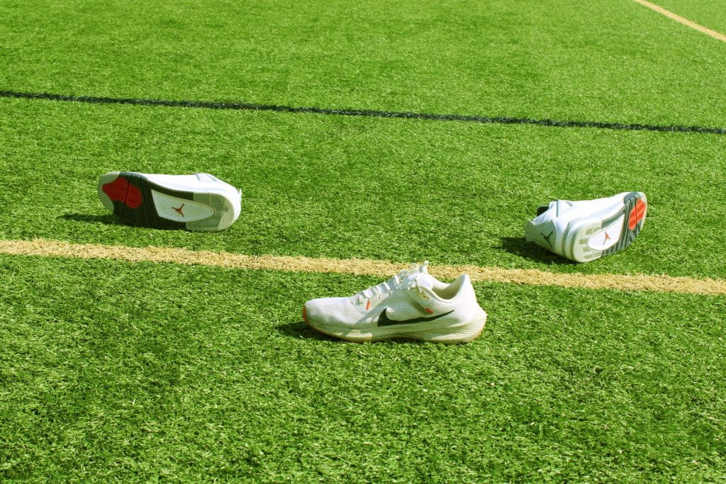
Balance – Asymmetrical
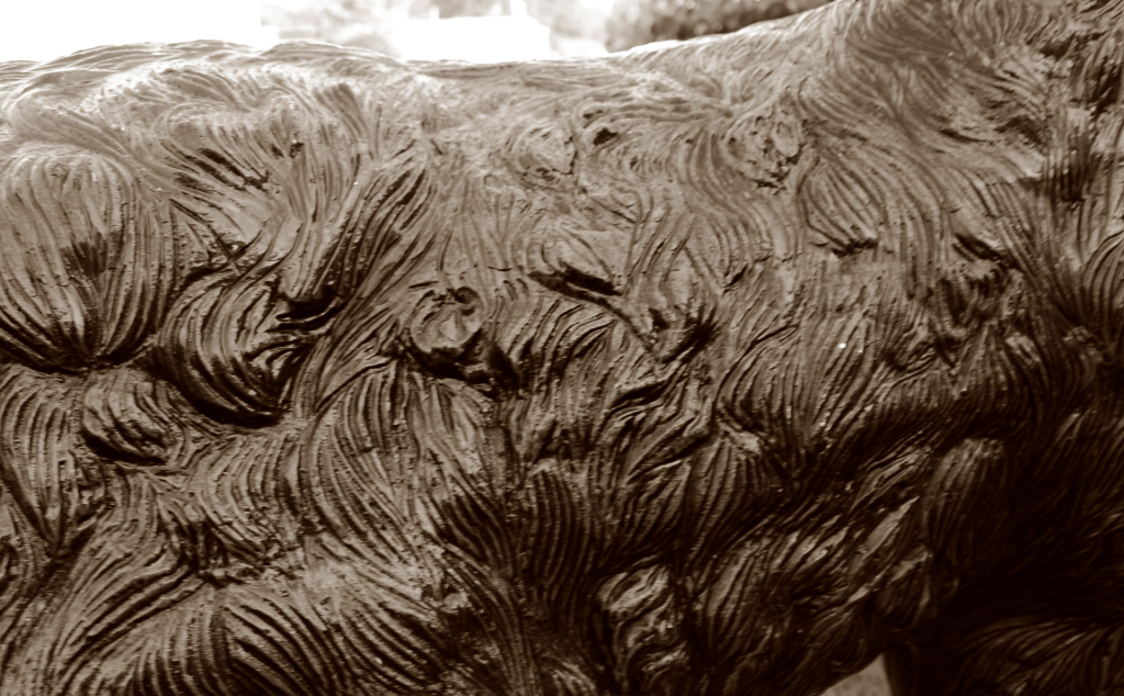
Emphasis – Contrast or Isolation
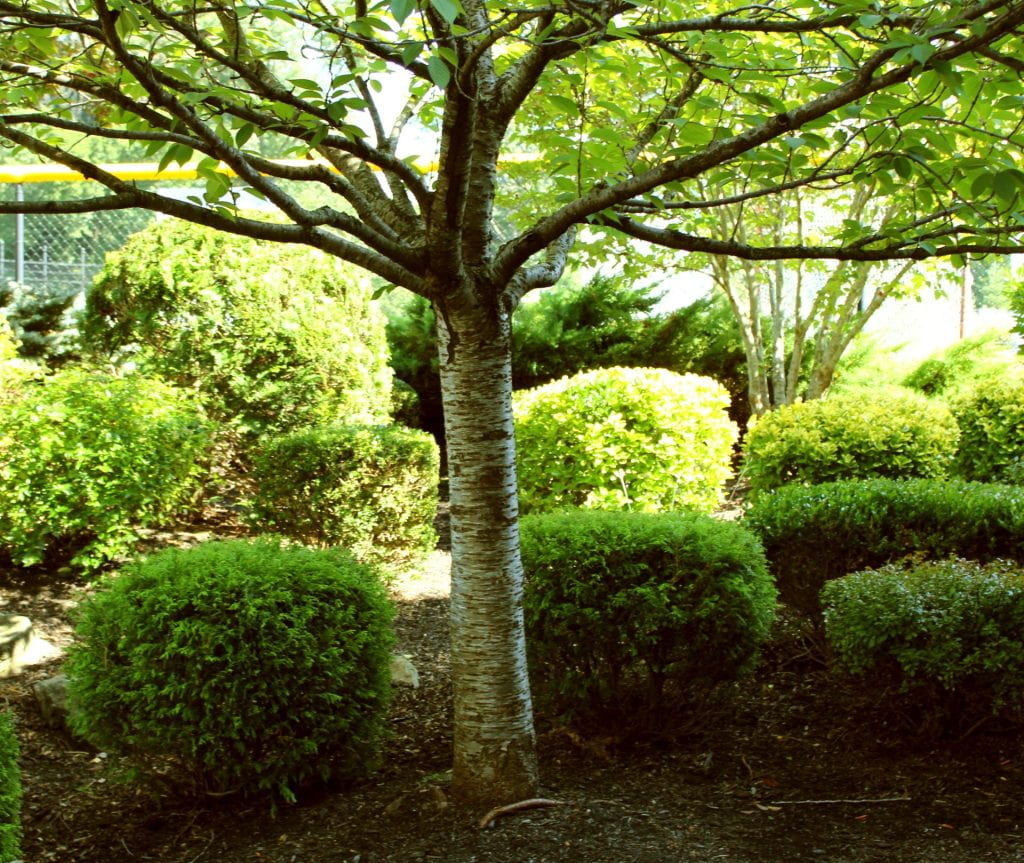
Emphasis – Scale or Placement
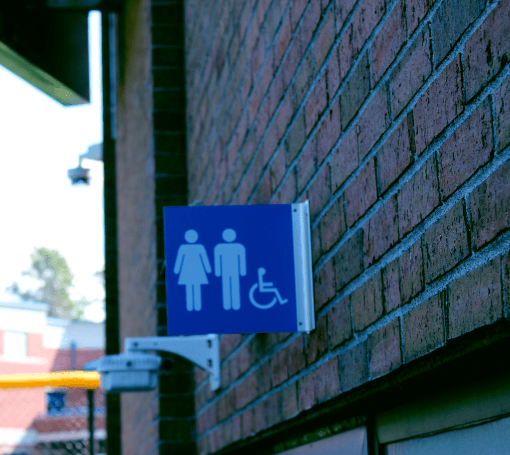
Emphasis – Color
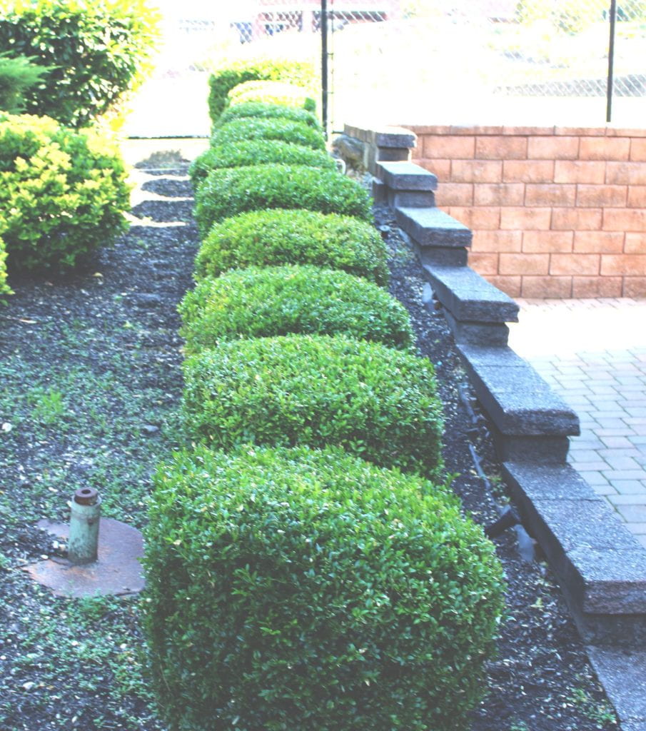
Proportion and Scale
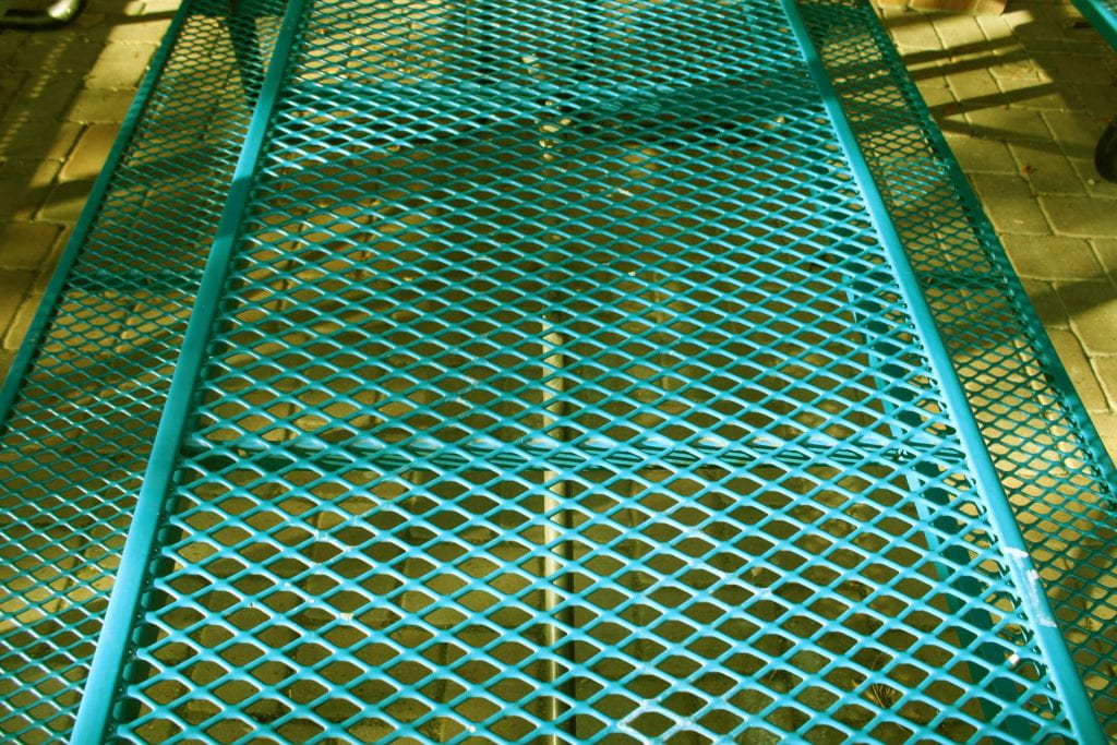
Pattern and Repetition

Contrast – Tonal

Contrast-Color
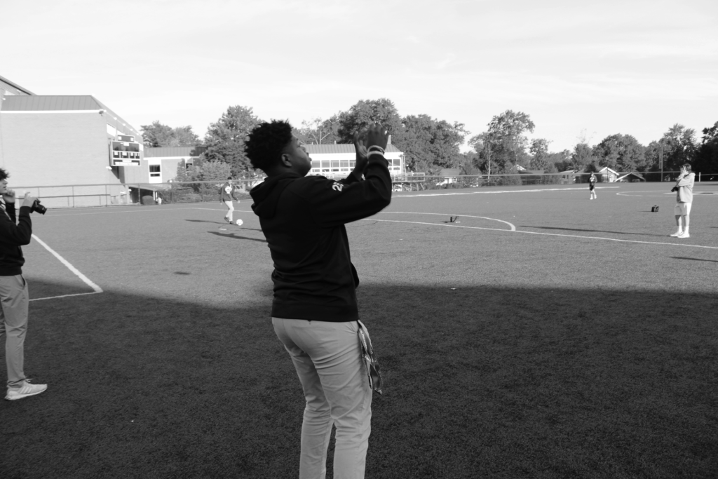
Movement and Rhythm

Unity-Harmony-Simplicity
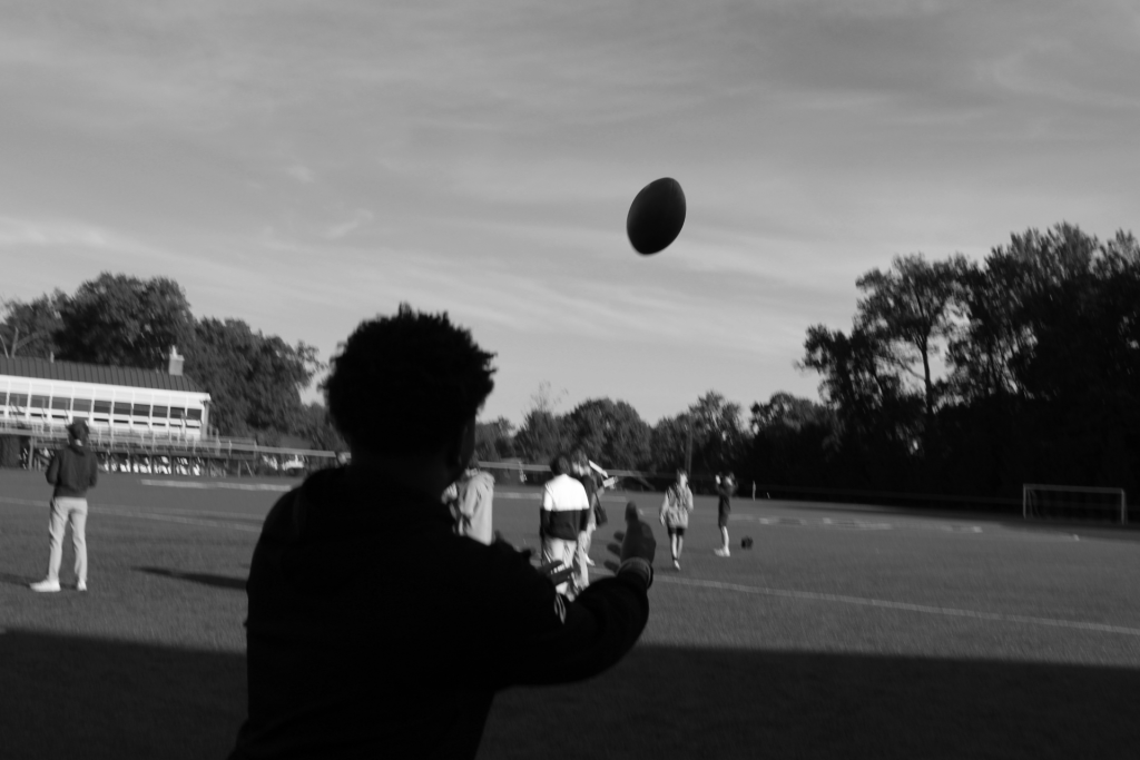
Unity and Harmony – Proximity
1. What strengths and weaknesses do you see in your own work?
Strengths I see in my work is creativity and finding new approaches to take photos. A weaknesses I see in my work is the editing with my adjustments. I continue to improve and work on my mistakes.
2. How might you improve or refine your approach in future photography projects?
I can improve or refine my approach in future photography projects by looking for new angles I can use to change it up a little and see how how the angle impacts the photo.
3. Pick one of your photos, what emotions or messages did you intend to convey through this photograph?
In my simplicity photograph it shows a white line through the big blue sky which I think shows peace and relaxation.
4. Are there specific principles of design you would like to explore further in your photography?
Yes, I would like to explore more into the contrast and emphasis part of photography.
5. What concepts or techniques do you want to experiment with in your next project?
The concept or technique I want to experiment in my next project is how to use lighting and the significance of it and how it can benefit our pictures.
I really enjoy the tonal and asymmetrical photos! They are so creative and fun to look at! I think you could do better on your contrast photo, it’s bland and unappealing. The photo of the tree uses SCALE AND PLACEMENT to draw the observer into the tree, and allow them to feel the embrace of nature.